Improving survey completion rates through prettier form design
No one gets excited about filling out a form. Forms are tedious and often visually unappealing. But with just a few smart design tweaks, they can actually catch the eye.
Sure, you could just grab a generic form template and swap in your questions. But if you want the form to fit your brand, your audience and your context, you either need to build it from scratch or thoughtfully adjust that template to serve your goals. That’s where design choices really matter.
If you are looking for some inspiration and practical advice on how to make your online forms or surveys look less boring, keep reading this article. We've prepared a real-life use case, and based on its example we'll break down all the Do's and Dont's of form design.
Use case:
Let’s take a small coffee shop collecting customer feedback. We want to print a QR code on receipts, but if it leads to just a Google Form, most people will ignore it. So we want:
- A feedback form that reflects your cozy brand
- Easy, mobile-first design
- A mix of quick inputs and optional thoughtful ones
Designing an eye-catching feedback form
In our example we'll be using Weavely to create the form. With the help of its AI functionality, we don't need to spend much time phrasing the questions. The tool also offers granular design customization, as well as can help us style our form with AI.
But form design isn’t just about making things pretty. There are common design mistakes that can actually tank your conversion rate. If you want to avoid those traps, check out this guide on the 7 most common form design mistakes. It’s a useful read before you hit publish.
Choosing the colour palette
Use your exact brand colours - you can extract them from your logo or website. There are tools that let you extract hex codes of colours, but with Weavely we can do everything in one place. We can just upload an image of the landing page of the coffee shop - and the form tool will automatically apply brand colours to the feedback form. If you're customizing your form manually, stick to maximum 2–3 colours total (background, text, and accent). Over-styling can kill clarity.
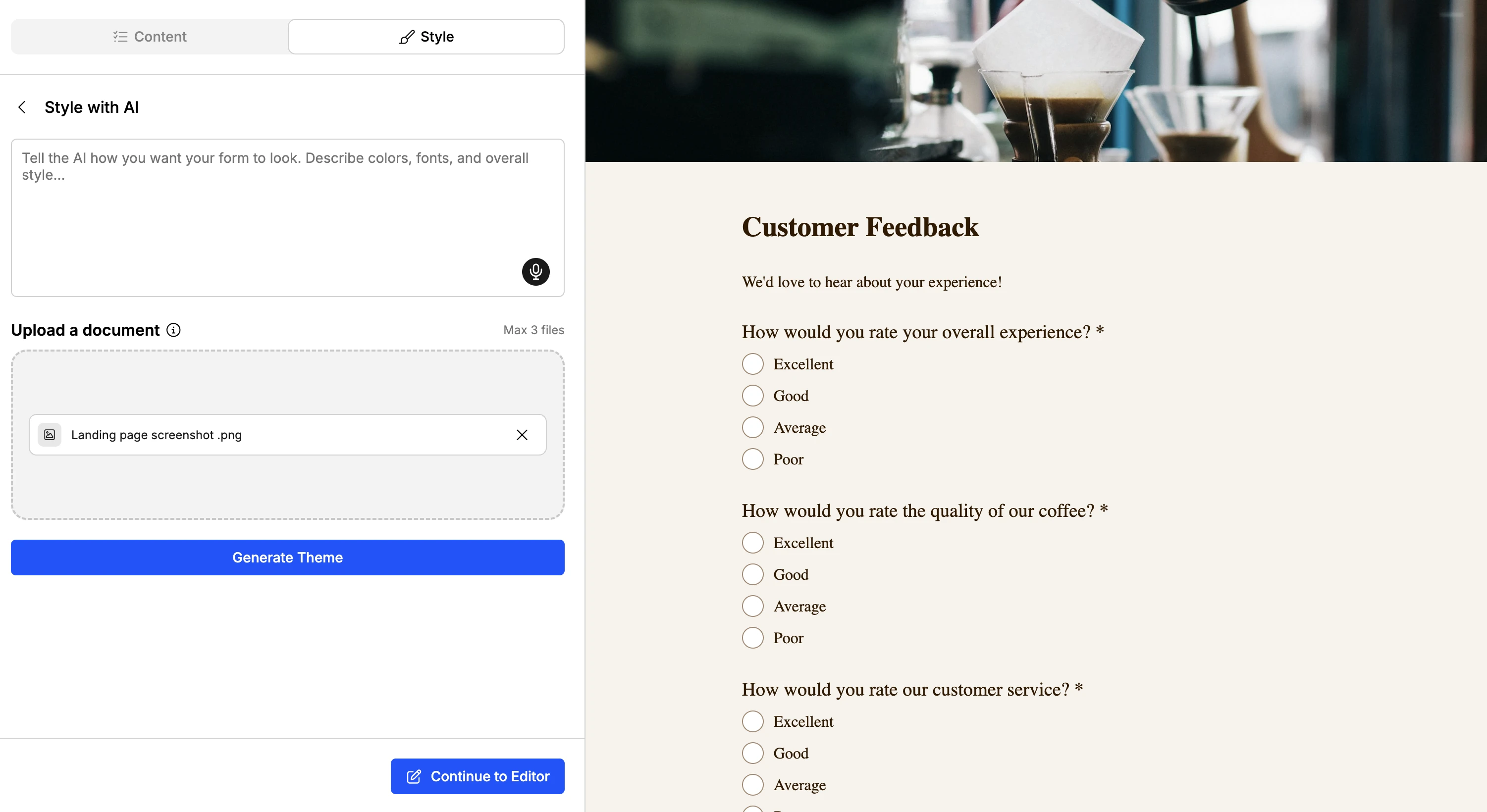
As you can see, Weavely automatically applied extracted colours to the form and even added a relevant image. Of course, you can further tweak the design if you want, adjusting the layout, and more.
Lastly, some more tips for applying a colour palette to your forms and surveys:
- Backgrounds: try soft gradients or a light tint of your main colour
- Buttons: high contrast, bold, but not blinding
- Field borders: avoid harsh black. Instead, try grey, muted blue, or other pastel colour
Add images
.webp)
According to a study on visual content in digital marketing, visuals do more than grab attention - they help clarify messages, reflect brand identity, and boost engagement, all of which contribute to higher conversion rates. So to increase your completion rates and make people want to spend time on your feedback survey, it's essential to add contextually relevant images.
For example:
- Product shots work well for e-commerce
- Lifestyle photography adds context (“Join the adventure,” over a hiking scene)
- Soft illustrations build warmth and feel less corporate
Position images left or right of the form, depending on where the eye flows best. Just don’t sandwich your form between two competing visuals. Usually, the left-to-right reading pattern is considered the most optimal, particularly in Western cultures, guiding the user from ambiance to action. In Weavely, it's easy to adjust the positioning of images with the layout settings.
Logos
.webp)
Don't forget about one of the most important brand elements - always add your company logo. Not only does it improve brand awareness, but also adds trustworthiness. According to UX research on cognitive load and brand trust, a recognisable but subtle logo in the top-left corner reassures users they’re in the right place.
Weavely lets you add logos for free. You also get full flexibility on how to place and position them in the form. The general guideline is to keep the logo visible but not dominant, ideally being placed in the top left or centre. Use a high-resolution logo with SVG or PNG format so it looks crisp even at small sizes.
Guide the eye: visual hierarchy is crucial
You want your form to be as straightforward as possible. Good design tells respondents where to look and in the right order.
- Use a bold headline or short intro at the top (e.g. “Save your spot ”)
- Emphasise the primary action with button size and colour contrast
- Group related fields together with spacing or subtle borders (top tip: when creating forms with Weavely, AI takes this into account and generates an already comprehensive form)
Use enough spacing
White space isn’t wasted space, it’s what makes the form readable. So don't be afraid to spread out your form fields or add padding.
Again, when generating a form with AI, it considers form design best practices, and you don't need to worry about any of the subtleties. Yet, if you are building your form manually or you don't find AI output optimal, stick to 16–24px for vertical spacing between fields and 9-12 px spacing between label and field.
Little UX touches that keep people going
Progress bars are super helpful in multi-step forms, as they break things up into smaller chunks and give people a sense of progress, which motivates them to complete the form or survey.
Hover states on buttons may seem small, but they give forms a tactile feel that confirms that clicks lead to actions. They sort of make things feel alive, and can also positively affect completion rates. Even something as small as an animated checkmark after a response is submitted can spark a tiny “ooh!” moment.
People remember forms that feel fun, even subconsciously. If you want to go a step further and understand what persuades people to fill out your form, this breakdown of proven persuasion principles covers techniques like commitment bias, social proof, and subtle cues that can boost completion without feeling manipulative.
Mobile check: is it still pretty?
Forms often look completely different on mobile. So make sure to check whether your design makes sense across different devices:
- Images should resize or stack
- Buttons need padding and thumb space
- Remove any visuals that don’t scale well
How can I make the form fields more visually appealing?
One of the easiest fixes is to slightly round corners of the fields in your form, just 4-8px (if it matches your aesthetic of course). Not all form builders give you control over such subtle features, but for example in Weavely, you can choose between 4 different roundings of your form fields and buttons.
Make sure that the form fields and buttons are both either rounded or not. Cohesion is important in form design. Another simple but effective trick is to use a coloured border stroke around form fields. It can help improve clarity, make your form prettier, and subtly reinforce your brand.
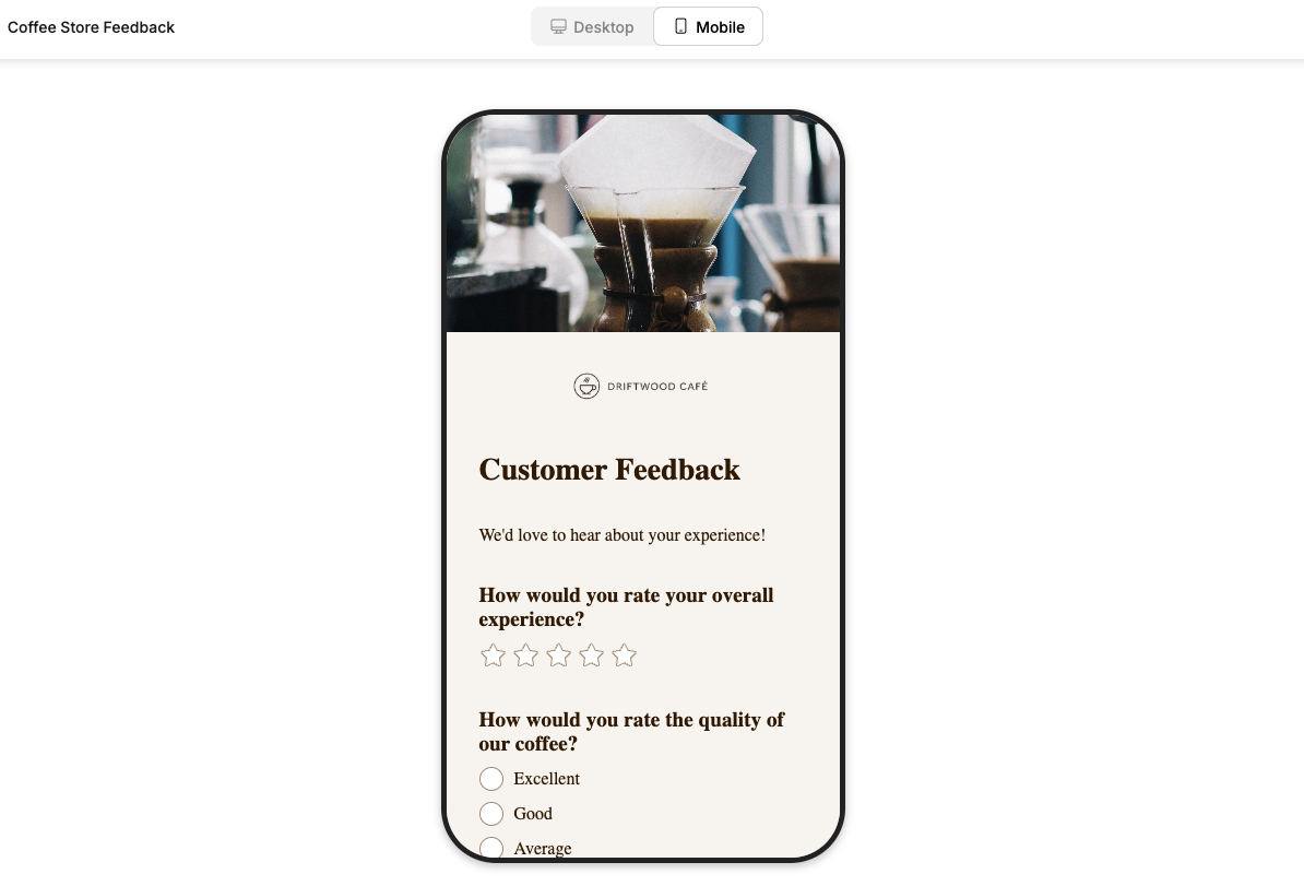
Overview: how we improved a form design of a feedback form
.webp)
What we ended up with is a form that feels like a natural extension of the brand, as we used the exact colours of the coffee store website, added a logo, and an image that would help respondents contextually recognise what kind of survey they are filling out.
From the clear visual layout to typography and soft colour palette, every element serves a purpose. The left-aligned image sets the tone without stealing focus, while the well-spaced fields, rounded corners, and form elements like star rating feel easy to answer. We used subtle visual cues, like soft strokes and consistent spacing, to keep it approachable. Let's quickly go through all the steps once again:
Image placement
We positioned a large photo on the left, which is recommended It’s atmospheric, on-brand, and doesn’t fight the form for attention. It sets the tone without getting in the way.
Cohesive visual style
We wanted to make the form immediately associated with the brand. colours (soft beige background, brown button, muted text) feel warm and aligned with the café vibe.
Typography & spacing
Clear, readable font choices with good vertical spacing between fields. We made the hierarchy solid, headings are bold, and supporting text is subtle.
Simplicity & flow
The form isn’t overloaded with questions. It's short, friendly, and visually structured to guide the user through a logical flow. This should help us collect more and better quality data.
Clean field design
Rounded corners, lightly highlighted borders, soft placeholder text. The fields look modern and unobtrusive, especially the long-form feedback box.
Frequently asked questions about form design
What makes a form feel “nice” to fill out?
It’s a mix of things: balanced spacing, clear structure, relevant visuals, and subtle interactions. When a form looks like it’s been designed with care, and not just a quick boring way to collect data, users are more willing to engage.
Can small visual tweaks really improve completion rates?
Yes. Simple things like hover states, progress indicators, and a well-placed image can significantly increase the likelihood that users finish the form.
Is there a form builder that can style a form for me?
Yes, Weavely.ai allows you to both generate content of the form and its design. You can prompt what aesthetic you envision, or upload an image/document with the desired colours, and Weavely will instantly style the form.
Can’t I just use a template instead of designing a form from scratch?
Yes, and in many cases, that’s a perfectly fine starting point. Form templates save time and can give you a solid structure, but they’re not one-size-fits-all. If you want your form to actually reflect your brand, feel more engaging, or serve a specific purpose (like gathering better feedback), you’ll likely need to tweak the layout, colours, wording, and visuals.
How can I make my form feel more integrated with the topic of the survey?
Add contextual cues. Instead of just placing a form in a plain box, try building it into a themed element. For example:
- A sign-up form for a cooking class floating over a background of kitchen gear
- A contact form embedded in a notepad mockup
- A feedback form inside a speech bubble graphic

Tatiana is the Growth Marketing Manager at Weavely, where she's spent nearly four years running marketing end to end. From campaign strategy to the SEO content that brings new readers to the platform. Working day to day on a form builder gives her a front-row seat to what actually makes forms, surveys, and landing pages convert, and that's what she writes about here: practical, tested advice on lead generation and form design. Before Weavely, she led brand and SEO work at Digital Leap and cut her teeth on B2B and B2C content at Ruddy. She's based in Brussels.
